Champion Windows
Be the Expert of your Industry with Mobile-First Development, Exploratory Visuals, & Snackable, In-Depth Content
THE CHALLENGE
Create In-Depth Web Content to Sell a Complex, High-Consideration Product
CLIENT
Champion Windows & Home Exteriors
PROJECT
Champion Sunrooms Website Redesign
TIMELINE
6-8 Weeks from Concept to Launch
STRATEGIC DESIGN PILLARS
- Prioritize Mobile-First Conversion Practices to Make Mobile Browsing Enjoyable and Appointments Easy to Book with Champion
- Leverage Visual Content with Pinterest-Style Product Positioning that Makes Champion’s Products Shine
- Easy-to-Scan, Snackable Content Layouts that Lead the Customer on Their Knowledge Quest, Moving Them Down the Funnel to Appointments
- Interactive Product Overlays That Engage Customer Answer-Seekers and Solidify Champion as the Authority on All Things Sunrooms
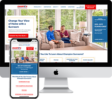
ABOUT CHAMPION
Champion Windows, like many home improvement manufacturers and retailers, sells most of their products seasonally. Their peak selling season is from March to October, when the weather is warm and mild and families are looking to improve their home’s efficiency without impacting their own comfort level.
1
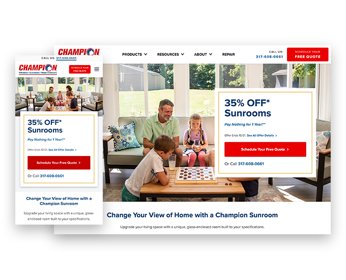
Mobile-First Design
Our UX team made the suggestion early on to break apart the complex information and spread it out over multiple lightweight content pages. We focused on a mobile-friendly layout first that then drove the desktop experience.
Why? According to Pew Research, 81% of U.S. consumers now have smartphones and 20% of those customers no longer use desktops, but instead use their smartphones as their primary browsing device.
2
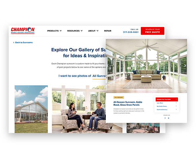
Visual Content with Pinterest-Style Product Positioning
Our second strategy was to use Pinterest-style product photography to reinforce product branding and crystallize the Champion message in the consumer mind. According to HubSpot, “…if a relevant image is paired with that same information, people retained 65% of the information three days later.” This means that big photos not only make Champion product shine, they also enable the customer to fall in love with the idea of their own sunroom and remember the Champion brand first.
Why? Big bold visuals create a connection to the product and enable customers to envision themselves using it in their own homes.
From our Partner

3
Easy-to-Scan, Snackable Content
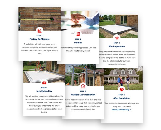
The amount of sunrooms information Champion has to offer could easily be overwhelming to a customer. We needed to allow customers to explore all of this content in manageable bites, using digital sign posts rather than long paragraphs of copy. We dotted the website with helpful icons that could provide quick FAQs and expert tips.
Several pages broke down complex processes into a simple set of easy-to-understand steps. HubSpot says that step-by-step instructions with illustrative elements exponentially increase direction following procedures: “People following directions with text and illustrations do 323% better than people following directions without illustrations.”
Why? Social media and mobile phone real estate has reinforced the need for brevity in online content. Creating snackable content allows for information retention and also makes the content feel less overwhelming. When complex information is displayed in a more customer-friendly way—such as step-by-step instructions and icon-based elements—the customer retains more.
4
Interactive Product Overlays that Encourage Customer Engagement
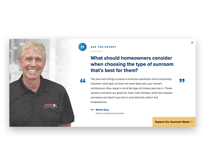
Interactive elements allow the customer to get up close and personal with the Champion product and reaffirm the quality behind the customer’s new sunroom. We collaborated with our client to create “Parts of a Sunroom” overlays that showcase the brand product commitments and establish manufacturing differentiators. Another interactive section walks customers through the various sunroom feature options accompanied by quotes from Champion’s sunroom engineers.
Why? Interactive elements that require the customer to move around the page to view content pushes the customer to engage and learn more, while still providing the information in a meaningful, creative way that still works on a mobile device.
Sales-Focused Design
Champion understands that their website is the front line for sales and factors heavily into their customer’s early buying research. In fact, they have invested heavily in making sure they are the experts of sunroom content, which keeps them top of mind for their customers.
High-Consideration Product
Adding a sunroom is a major home addition project, making this a high consideration product. Champion understands that their customers need many questions answered before they are comfortable asking a salesperson to visit their home.
Correct Timing & Strategy
Champion Windows must be very strategic in their selling cycle, providing the right content at the right moment in the buyer’s journey. Sean Grace, Digital Marketing Manager at Champion, came to Magnetic Mobile looking to optimize lead generation and move their customers down the funnel. The final goal is to get customers to book an in-home appointment for a Sunroom consultation with a Champion Sales Representative.
Product Representation & Conversion
Champion came to Magnetic with copy and an outline for the entire Sunrooms section of their website. Our task was to visually represent the complex product information in a way that educates the buyer and ultimately leads them to convert by booking an appointment.
CONCLUSION
We launched the Champion Sunrooms pages on schedule, within budget, and even innovated with the client along the way. We will continue to monitor customer engagement metrics to ensure that our four design pillars deliver to Champion’s goals. We are confident that combining industry-leading best practices with client collaboration will result in success.
Interested in Learning More About How We Can Partner with You?