
1. UX Design Navigation Based on User Device
I have seen many attempts to make mobile menus work well on both mobile and desktop from a UX design standpoint. At Magnetic Mobile, we even played with only having the hamburger menu even for full desktop, but the process never seems to fit the platform. Recently, I came across a wonderful use of of creating a menu based on the device needs. Christian Louboutin, a French luxury shoe maker, known for their “red bottom shoes”, delighted me with a great departure from same menus to rule them all.
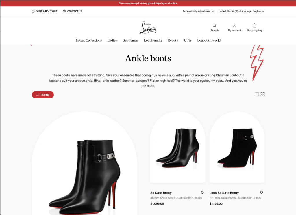
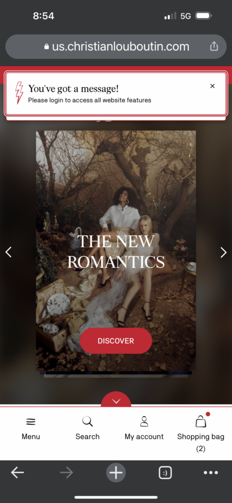
They actually have a mobile web and desktop view with a very consistent menu architecture based on device need. Their mobile website navigation is set up much like a native app menu, which is easy to use and is a very popular and succinct way to get consumers to the main section of their website. What I love about their UX design is that on their full desktop they use what works best for the space of the real estate they have with large, beautiful full drop downs that look stunning on a desktop.
2. Co-Branded Digital Branding
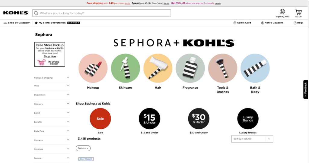
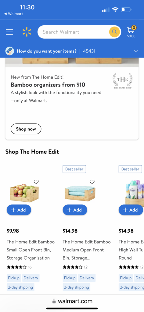
I have been seeing this trend in stores for awhile but now I am also seeing it in the digital carving of a brand’s digital real estate. Khol’s and Walmart carve out big real estate with sub menus and “digital branded product departments” for co-branding. Sephora and The Home Edit, have such huge followings that both their physical and digital real estate garner their own marked real estate online and in-store. The area is so sacred, only products from the brand are shown and can be filtered, creating a niche product line within the greater brand.
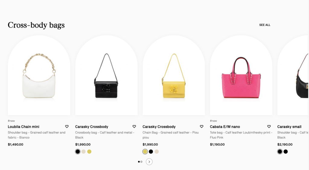
3 Rethinking UX Design and the White Product Box
Every website has the same products on a white background that you need to scroll through endlessly, white boxes after white boxes. When I see something that strikes a different vibe that is just a product product on a white box, then I am intrigued. Another different take on UX design is the white product boxes from the Louboutin redesign, arched boxes, its simple but it reflects the creativity of the brand’s luxury brand promise.
4. Infinite Carousels with Personalized Endless Aisle Options
We have seen a lot of pull back on carousels over the years and the previous data-backed opinion is that people wont scroll more than six items. However, with the onsite on all virtual shopping, especially in the grocery industry over the last few years, the concept of a personalized “endless aisle” in the digital sphere is back. I have seen this popping up on Target, Kroger, and Kohl’s where product catalogs are deep and the idea of bringing “impulse purchasing” to digital is a more compelling use case.
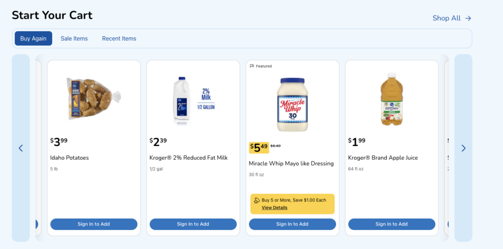
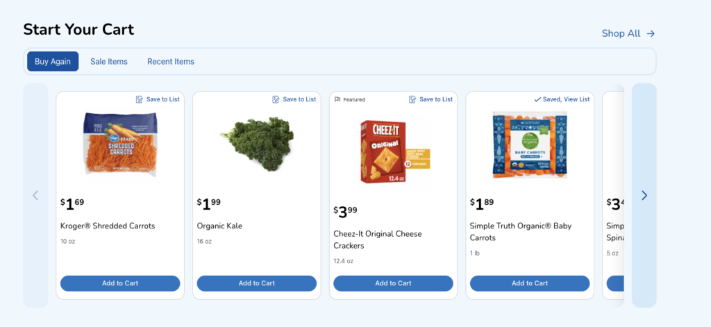
“Digital aisle wandering” will be the next big wave of technological e-commerce advancement from a UX design standpoint. Amazon has been the reigning king of this concept; however, balancing the right UX while not being too overwhelming is all dependent on knowing your audience and serving then exactly what they want to see. Personalization is the great equalizer in the infinite carousel game.
Below, I site two examples – one with anonymized data and one with my own personalized data layered in based on my shopping habits, loaded after login. These examples couldn’t be more different and Kroger, having access to this data, is smart to serve me my personalized endless aisle. More brands should follow Kroger and Amazon’s leads. In both cases I am more prone to impulse purchase off my “endless aisle” list as opposed to a generic “endless aisle.”
5. Web Shortcut Slider
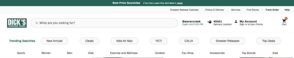
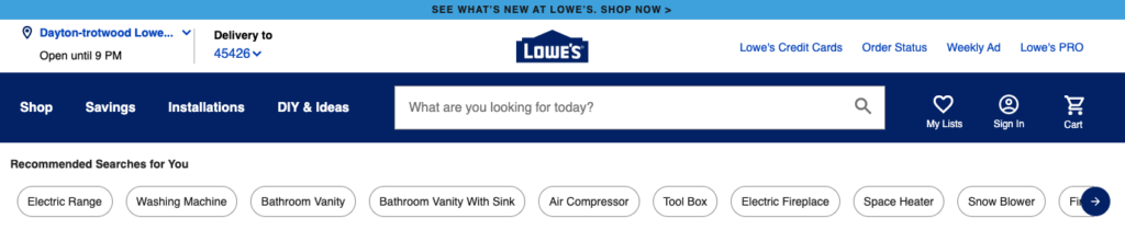
We all know that retail sites are complex – with thousands of SKUs across dozens of departments, these sites have become virtual malls of products and brands. I love designers who are constantly trying to evolve and improve the way consumers search through their websites and apps. One trend I saw is the quick search headers at the top. Lowe’s and Dick’s do a fantastic job of creating a quick jumping off point for their customers without taking away from valuable real state while also getting me to look at a different type of hierarchical site architecture. Lowe’s even made it a slider, I love that!
All these features help users spend less time overthinking and more time enjoying our web site experiences.
Do you have any mobile app UX design trends that you would add to this list? Let me know.